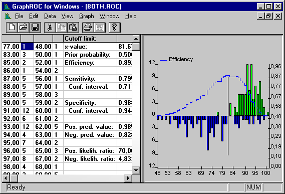

Figure 6. Same distributions as in Figs. 3. and 5. The efficiency curve is displayed on the distributions and the cutoff limit has been set to maximum efficiency. Note that the efficiency curve is dependent on prior probability of disease. In GraphROC the default for prior probability is the proportion of illness related values in the source data, but the user has also an option to enter any prior probability and see how the shape of the efficiency curve changes. Specific numeric information about the chosen cutoff limit is available also in the data window.

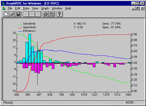
Figure 7. This example shows the peak Lactate Dehydrogenase activities (U/l) in patients with chest pain (patients with no proven infarction above x-axis and patients with diagnosed myocardial infarction below the x-axis). The display has been restricted only to the overlapping area of the two distributions. The sensitivity, specificity and efficiency curves are superimposed and their scale is on the right side of the graph. The graph demonstrates that determination of the peak of the efficiency curve is not always straightforward as the curve may be rather flat-topped. It is important to consider which is clinically more important: good sensitivity or good specificity. According to this judgement the optimal clinical decision limit would then usually be either in the left- or right-sided corner of the flat part of the efficiency curve. The X-, Y-, clinical sensitivity and specificity values in the upper right corner update instantaneously for any pointer location and thus help in the interactive estimation of optimal clinical decision limit.