Comparison of health and illness related data
The bin widths of the distributions, the level of confidence in the confidence intervals for clinical sensitivity and specificity, and the prior probability of disease used in the calculation of predictive values and efficiency can be changed in the Data Options window. The bin width changes take effect first after performing a recalculation by selecting Data Calculate. In the Graph Options window, the
defaults for the graphical display can be changed. It is possible to hide the parts of the
distributions which are outside the overlapping area, select for display the bin width
defined in Data Options and optionally show also clinical sensitivity, clinical
specificity and/or efficiency curves. To print the output by your printer, select File
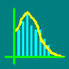
Print when the preferred window is active. Data import Graphical display of the distributions After importing the data, the health related distribution is shown above the x-axis and
the illness related distribution below the x-axis. This kind of graphical double histogram
display has been previously described by Gerhardt and Keller (1986) and used in the
computer program Testevaluation (Gerhardt & Olsson, 1990). By default the
distributions are shown using the original bin width, but different bin widths can be
defined in the Data Options window.
In the upper right corner of the graph the X-value (cutoff limit), Y-value (frequency),
clinical sensitivity and clinical specificity values are shown for the current cursor
position. These values update every time the cursor is moved by the mouse. By clicking the
left mouse button, more detailed numerical data for the current cutoff limit will become
visible in a separate Calculations window. Calculations window Data options Graph options Hide unnecessary data Show original distribution
Show sensitivity curve
Show efficiency curve Clinical efficiency at a certain cutoff limit is the proportion of correctly classified
cases (proportion of the sum of true positives and true negatives of the whole
population), when using the limit as a clinical decision limit. Unlike clinical
sensitivity and specificity, efficiency is dependent on prior probability of disease,
which can be defined and also quickly changed in the Data Options window. The
efficiency curve updates immediately thereafter. The used prior probability can also be
seen, but not changed, in the Calculations window. Figure 4. Same distributions as in Fig 3. The clinical sensitivity, clinical specificity and efficiency curves have all been chosen for simultaneous display from the Graph Options. Figure 5. The
chosen cutoff limit is shown as a vertical line. In addition to the numeric frequency
distributions, the data window also includes specific information about the cutoff limit.
The graphical output can be printed together with the following numerical information: Health related distribution: number of observations,
mean, standard deviation, class width, lowest and highest value; The graph will be printed according to definitions given in Graph
Options. The printing is done by the Print File command. Before printing, the
program asks for a title for the printed output. The title will be printed above the
graph. Previewing is possible by the Print Preview command. Any selected data in the left-sided data window can be exported via Windows clipboard to other software running under Microsoft Windows by using the Edit Copy data command. The graph from the right-sided window can be exported via clipboard by using the Edit Copy graph command. ROC curves
Figure 8.
In this example several ROC curves have been combined into one graph. The ROC-curve for
MCV (erythrocyte mean corpuscular volume) corresponds to the frequency distributions shown
in Fig. 5. In addition to that the ROC curves for MCH (erythrocyte mean corpuscular
hemoglobin) and Eryt (erythrocyte count) are shown as obtained from the same set of
samples. The areas under curve (Area) with corresponding standard errors (SE) are
shown under the curves. Note that the bin width defined in the Data Options window
will also affect the number of cutoff limits used in the generation of the ROC curve. The
larger the number of cutoff limits, the more precise the ROC curve is and the smaller is
the standard error estimate for the area under curve. Consequently, it is usually more
preferrable to use the small original bin width in the generation of the ROC-curve than
any larger bin width (Zweig & Campbell, 1993). However, sometimes when comparing the
ROC-curves of two tests with very different original bin widths, it may be preferrable to
use statistically optimized bin widths for both tests instead of original ones. Then the
comparison can be done so that the original bin width does not affect the ROC-curves and
their comparison to each other (Kairisto, 1995). Compare ROC curves command (Data menu) Use this command to perform statistical comparisons between two ROC curves. Before using the command, the ROC curves window should be opened. Probabilities (p-values) are calculated for the null hypothesis that the two ROC curves present random samples from similar underlying data of sensitivities and specificities. Note that the p-values are applicable only for the comparison of two ROC curves at a time. GraphROC compares all the ROC curves that are present in the ROC curve window and the p-values are shown in a table in the ROC curves comparisons dialog box. GraphROC includes both the paired and unpaired methods of ROC curves comparison. If the two tests under comparison have been performed on exactly the same set of subjects the paired method of comparison can be used. In this method the within-subject correlation of tests is considered and consequently smaller differences between two ROC curves can usually be found significant. If ROC curves originating from partly or completely different sets of subjects are compared the unpaired method of comparison should be used. Note! The p-values calculated by GraphROC are two-tailed significancies of difference between the two ROC curves. If there is no a priori knowledge that either of the two tests is better than the other, then this two-tailed test is appropriate. However, if there is a prior knowledge that e.g. test 2 is likely to better than test 1 and if we are only interested in improvements, then the one-tailed test is appropriate. To obtain the one-tailed significance of difference, divide the p-value given by GraphROC by two. Figure 9. In this example the command Data Compare ROC curves was given when the ROC curves window included three ROC curves. The names of the ROC curves will become visible as row and column titles in the p values table. This example shows the unpaired comparison of areas under the curves. GraphROC includes both the unpaired and paired methods of comparison of areas under curves and of individual points on two ROC curves. For paired comparison, see Figure 10 below. Figure 10. The MCV and MCH values originated from the same set of samples and thus paired method could be used here for the comparison of areas under the ROC curves. The p-value for paired comparison is 0.184 when for unpaired comparison it was 0.619 (see above). By the paired comparison smaller differences may be judged as significant because the method considers the natural within-subject correlation of test results.
Paired methods of comparison of two ROC curves Paired method is the superior method for comparison of two ROC curves if the two tests under comparison have been examined on the exactly same group of subjects. Please note that the paired method is possible only if each value can be linked to other test value from the same subject. This means that the number of values in each of the health related data sets must be the same as well as the number of values in each of the illness related data sets must be the same. Additionally the values must be in the same order, i.e. values from one individual must be on the same line in the two source data *.roc files. This comparison is not possible when importing the data in frequency table format via Windows clipboard because the frequency table does not preserve the order of the observations. Please note also that when GraphROC saves the *.sm1 and *.roc files, it automatically sorts the data in ascending order; thus paired comparisons cannot be made between *.roc files which were generated by GraphROC. Paired comparison of areas under two ROC curves Paired comparison of points on two ROC curves Unpaired methods of comparison of two ROC curves Unpaired method is the general method of comparison which must be used always when the data sets of comparison do not originate from the exactly same group of subjects. For unpaired comparisons the order of observations does not affect the calculations. If the ROC curve window includes several ROC curves, all the ROC curves are compared to each other and the corresponding p-values are tabulated in the ROC curves comparison dialog box. Unpaired comparison of areas under two ROC curves Unpaired comparison of points on two ROC curves Data options - Partial areas under the ROC curve The total area under the ROC curve is in some sense an imperfect measure of the performance of the diagnostic test. The total area under the curve reflects the test performance at all possible cutoff levels although the actual clinical cutoff limit is usually at such region of the ROC curve, where the clinical sensitivity and clinical specificity are fairly good. An alternative to the total area under the curve is to restrict the area to a relevant portion, e.g., the area under the curve for observed specificity >0.6 or for sensitivity >0.7 (Zweig & Campbell, 1993). When the ROC curve window is active the Data Options command offers the
possibility for graphical display of partial area limits. By ticking 'Show partial area
limits' under Data Options this option can be chosen. The limiting values for
sensitivity and specificity can be entered here manually, but it is also possible to drag
and move the horizontal sensitivity limits and the vertical specificity limits directly in
the graph by mouse. Any combination of sensitivity and specificity limits is possible. The
partial area under the curve is displayed numerically in the lower right corner of the
graph. This value updates rapidly whenever the sensitivity and/or specificity limits are
moved. Unfortunately GraphROC does not yet include a method for the standard error of the
partial area estimate.
Any numerical data in the left-sided data window can be exported via Windows clipboard
to other software running under Windows. In GraphROC, select first the appropriate data
cells in the left-sided data window either by mouse or by keyboard. If you use mouse, hold
down the left mouse button and select all the cells you want to copy. By keyboard, the
same procedure can be made by holding down the Shift key while moving in the table using
arrow keys. After choosing the cells to copy, select Edit Copy
data. After this, the data is available in the Windows clipboard, from which it can be
imported to other software by using the Edit Paste command in the software, where
the data is imported to. It is also possible to export the original observations as such by using the standard
GraphROC files for they are simple ASCII-files which can be read in to practically any
software. Use the File Save command to create these files.
From one distribution analysis, all observations will be stored in one column, one
observation on each row (files with the extension .SM1). From two distribution analysis,
observations will be stored in two columns: the left-sided column contains the
health-related data from the upper distribution and the right-sided column the
illness-related data from the lower distribution (files with the extension .ROC). Note
that if you have performed the outlier exclusion in GraphROC, the outlying values will
also be missing from any possible later created ASCII-files. All graphical outputs, which can be created by GraphROC, can also be exported via Windows clipboard to other software running under Microsoft Windows. In many graphical software programs, it is possible to change the imported graph to several objects, which facilitates easy editing of the graph. For example, it may be necessary to adjust the text, change colours or sizes or remove or add some objects or text. If several ROC-curves have been combined into one graph, some parts of the corresponding texts may be overlapping each other. However, moving of the different text blocks is possible. All this can be done in most of the graphics programs running under Microsoft Windows.
In the GraphROC directory you can find three sample files, which include data of erythrocyte mean corpuscular volume (MCV, fL). HEALTHY.SM1 includes health-related data, ILL.SM1 includes data from subjects with iron deficiency anemia and BOTH.ROC includes the both data sets to demonstrate the two distribution display and ROC-curves. The data sets are the same which are displayed in Figures 3., 4., 5. and 6. above.
|
GraphROC
|